


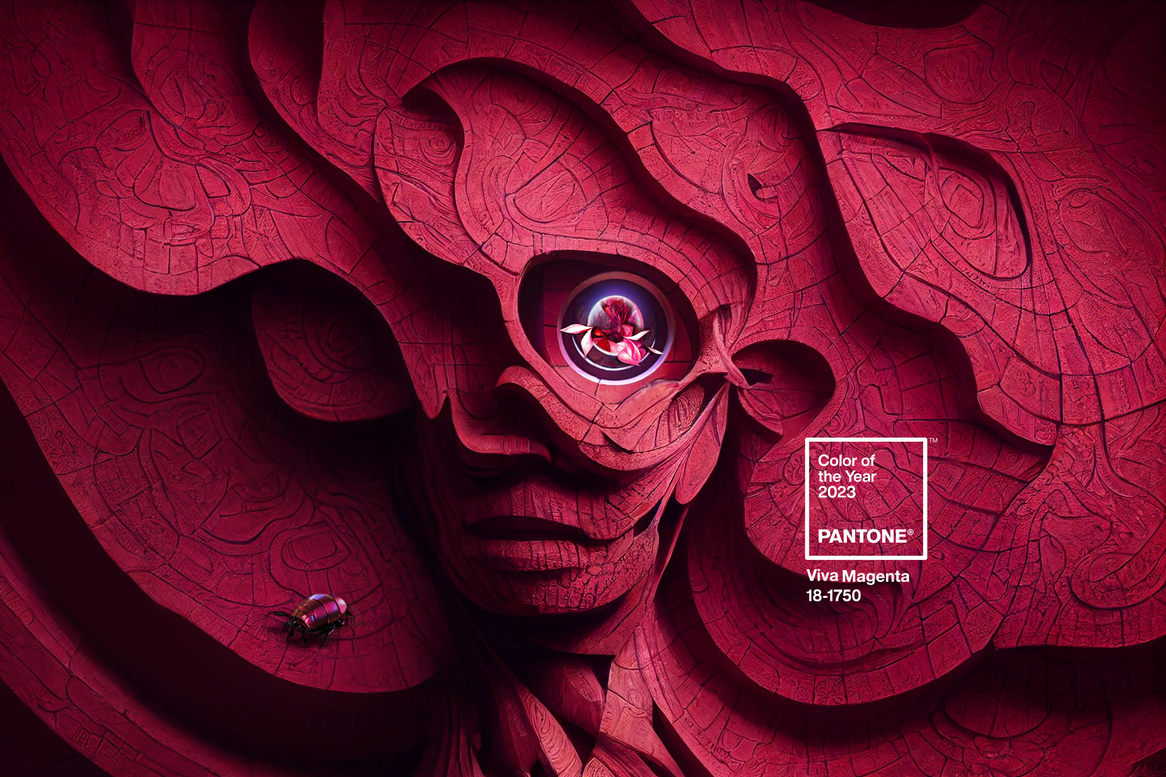
So the Pantone 2023 Color of the Year is Viva Magenta. It is a blending of nature and tech. When I first saw the promotion for the color I immediately thought tech.
The image is other worldly and exudes a somewhat futuristic feel mixed with a kind of bold “where no man has gone'” vibe. If you look closely you see the photo of a floral image dead center in the eye. Pantone explains the selection and significance this way….
Tapping into the experimental spirit of Viva Magenta, Pantone explores the dynamic between Artificial Intelligence and human creativity to create “The Magentaverse.”
Pantone
Time magazine did an article recently that describes it this way:
a study in balances: drawing on both warm and cool tones, the color’s origins are grounded in nature with an electrifying hue that can be found in both the physical and virtual spheres, speaking to the diversity of our contemporary world.
Time Pantone’s Color of the Year
That gets us to the heart of this article. For designers and for homeowners alike, what makes this color unique, different, and fresh but also what makes it familiar enough to become useful in our plans for a design inspired by nature?
Rooted in Nature
First, the color is surprisingly rooted in nature. The ancient Aztecs and the Inca civilizations were among the first to value and refine the process of making the crimson red dyes derived from the Cochineal beetles. The red dye has been the source of rich red hues on fabrics and paper since the second century BC. The scarlet and crimson hues of this timeless blend of mordants and powder from the beetles inspired Viva Magenta. The video above gives an in depth look into the ancient process used in Peruvian textile dyes.
What is Unique about Viva Magenta?
What makes Viva Magenta unique is the way in which the color is a departure from nature. There are a handful of colors that are not real so to speak. That is to say that there is no wavelength that corresponds to anything in nature. Magenta is one of them.
Magenta is an extra-spectral color, meaning that it is not a hue associated with monochromatic visible light. Magenta is associated with perception of spectral power distributions concentrated mostly in two bands: longer wavelength reddish components and shorter wavelength blueish components.[5] via Wikipedia
So what does that mean and what makes that useful in interior design? Viva Magenta is an intensified magenta that combines equal amounts of blue and red and has the ability to act as a bridge between warm and cool colors. This is especially timely in the world of interior design as we are coming off of a decade of gray, gray, and more gray. Most consumers do not have the budget to do an instant overhaul of their entire color scheme throughout their home to get to a warmer color palette now trending.
Viva Magenta can inject some warmth into your cool colors and give you an instant update. It can also act as a bridge between some of the cool colors so popular throughout the last few years and those that are available in the marketplace today giving the consumer the ability to transition into a new color scheme that works with existing fabrics and colors on upholstery, wallcoverings. and carpets.
It can be bold but it can also be subtle. Here are a couple of my own designs (Badalucco Design), Floral Stripe and Ancient Poppies in Viva Magenta.


This wallpaper is a bold expression, playful, and fun. The pillow to the right can be one pop of color in an otherwise neutral palette. There is a wide variety of applications where Viva Magenta is the perfect color choice to get you to a new look that also is grounded in nature in some way.
Viva Magenta Fabrics and Wallpaper For Your Home
Here is a link to a wonderful article on Spoonflower showcasing several pattern designers featured below. They were invited to interpret Viva Magenta with new designs in their own way. Included are comments in their own words.

Artist: Judy Quintero Design: Wonderful World
The tree represents how resilient and brave humanity is, even through the strongest winds. The planets are there to remind us of those things that have direct impact in our lives and in our future, like science. They are the essence of who we are and so we must continue our efforts to protect while exploring in order to continue our evolution for a better tomorrow. It is our legacy and what we leave behind. The spinning wheel/sun is my way to pay homage to the textile industry that I love so much, but also to celebrate how far we’ve come with the help of technological advancements. It’s my way of saying look how we started and how far we’ve come.

Artist: Cecilia Mok Design: Ecology
I imagined a new concept of a mysterious flourishing garden celebrating the harmonious colors and allowing the strongest color to support the soft palette. I was much happier allowing the colors to step into their own.

Artist: Brittany Jepsen Design: Floret on Gray Lilac
I’m endlessly inspired by flowers and I couldn’t help but go with a bold floral pattern in wide blooms with a dose of whimsical berries for the announcement of 2023’s Color of the Year. It screams beauty and nature, but in a fun way. The more muted colors allow the pattern to become a wonderful canvas to artwork when used as a wallpaper while the bolder color becomes a striking statement—a high drama moment!
Each of these designs used different palettes to achieve unique results. The first two used warmer complimentary colors that are softer than the Viva Magenta resulting in a great mix of tones for the patterns. The third one made use a a gray background. The gray is cooler but this design palette is great for those with some gray they need to blend with new warmer tones .
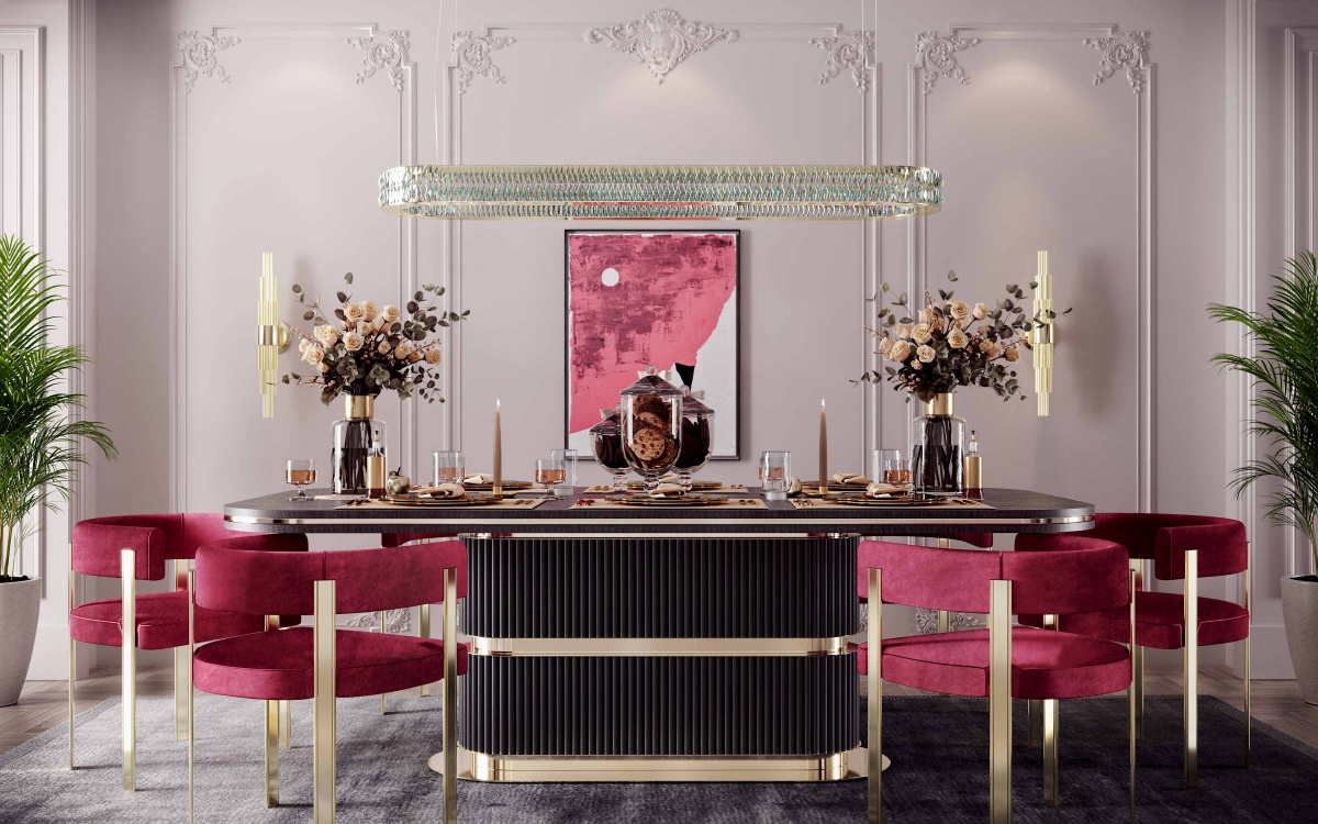
Viva Magenta Furniture For Your Home
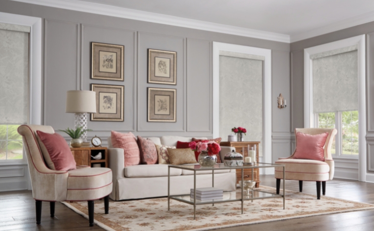
This is such a great example of how Viva Magenta can add warmth and color to a gray room. The chairs and the art are the perfect compliment to the walls and carpet. I love the result. Chairs are available to purchase on the Castro Lighting website link below.
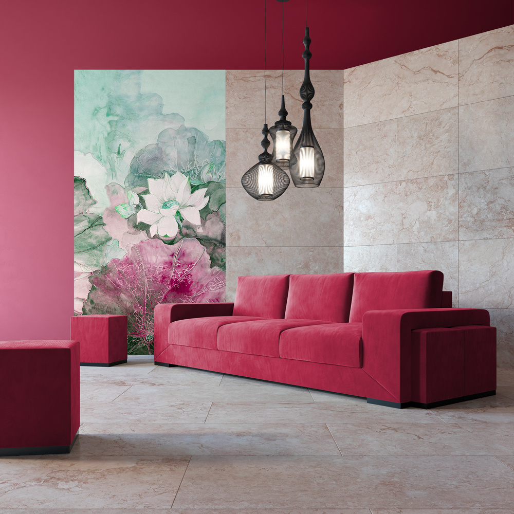
A sofa in Viva Magenta is the perfect compliment to this room with warm Travertine walls and flooring. The photo below also exhibits accents of Viva Magenta in the wall art. It is modern yet warm. That really is part of the magic of Viva Magenta.
Check out Jetclass for a really nice selection of sofas and more.
For a more bohemian vibe Urban Outfitters masterfully blends a Viva Magenta upholstered sofa which is at home with silk and nubby knits.
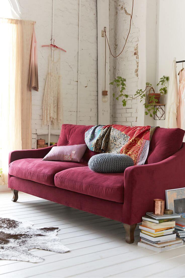
Urban Outfitters
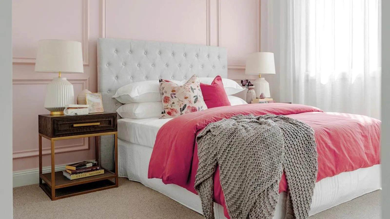
Just in case the above images give you the impression that rooms designed with Viva Magenta are always bold and intense here are some examples that show it can also be skillfully blended with softer color palettes for less intense results such as this bedroom featuring a white bed-board, light pink walls and warm gray accents.
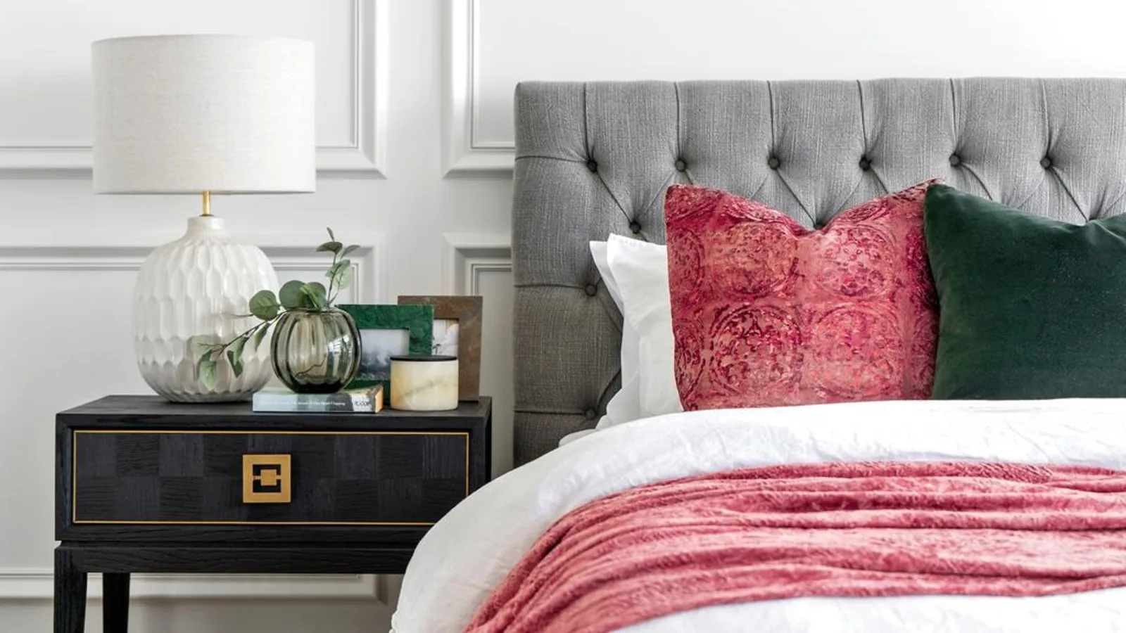
Even less, this room shows that even a small pop of color in one pillow and some well placed flowers in Viva Magenta can be just the right touch to give your room the look you want.
Final Thoughts….
Just like so many innovations, color that is rooted in nature and enhanced by technology such as Viva Magenta can give you the best of both worlds. I think that Pantone’s color of the year for 2023 succeeds in blending what is best about tradition while offering undertones in both warm and cool colors that can be used to enhance almost any style be it traditional, contemporary, or bohemian as shown in the examples in this article. If you are in transition and looking for a color that can bridge the cooler grays of your fixed furnishings with warmer touches while infusing a pop of color or something more dramatic, Viva Magenta might be your color!
If you enjoyed this article and would like to stay in the loop you can sign up below and join our list for future sales, discounts, and new product offerings as they become available. Hope to see you next week!